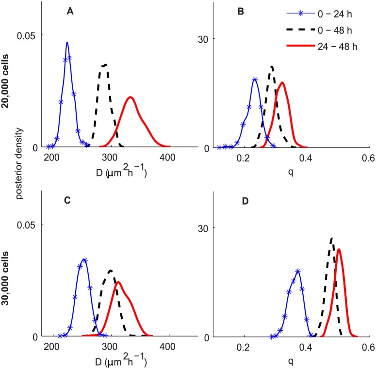
Fig 6. ABC posterior distributions for D and q for experiments in Scenario 1.
Subfigures A–B and C–D correspond to the experiments initialised with 20,000 and 30,000 cells, respectively. In all subfigures, the blue curve with markers, the black dashed and the red solid curves correspond to the ABC posteriors for 0–24 h, 24–48 h and 0–48 h, respectively.

