
Figure 2.
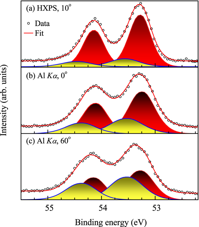
(a) HXP spectrum at 10° emission, CXP spectra at (b) normal emission & (c) 60° emission. Open circles represent experimental data and the superimposed lines represent the fit. The shaded regions show the component peaks simulating the experimental spectra.