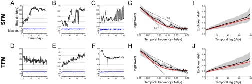
Fig. 3.
Results of the 3-mo time-series study (experiment 3). (A–F) Examples of daily time series of the SFM (A–C) and TFM (D–F) variables in six participants. For each series, the bias direction is shown in black as a function of time in days and the bias strength in blue. (G–J) Macroscopic analysis of time series data. Black curves show the means, the gray regions the 95% confidence intervals (between-participant bootstrap), and the red curves the predictions of the fitted noisy random walk or IMA(1, 1) model. Power spectra of the (G) SFM and (H) TFM series, on a log–log scale. The dashed lines show 1/f and 1/f2 spectra for comparison. MSED between (I) SFM and (J) TFM bias vectors measured on different days, as a function of time between measurements (lag) in days. Because bias vectors lie inside the unit circle, variables range from –1 to +1, and maximum square distance is 4.

