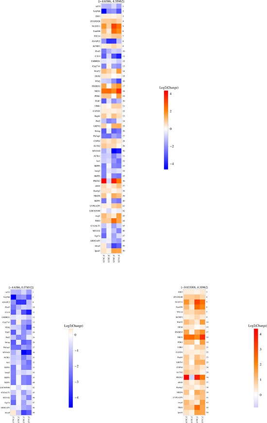
Figure 1. SAGE-based analysis of transcripts differentially represented in each pair of LTC vs LTP samples.

The heatmap shows the top 50 highest ranking RNA molecules, based on their “average merit”. The middle panel shows all 50 top RNA molecules, based on their average merit; in the left panel, only RNAs underexpressed in each LTC vs its own LTP are shown; in the right panel, only RNAs overexpressed in each LTC vs its own LTP are shown. The range of Log2 change is depicted in the vertical color bar on the right of each panel, and the corresponding numbers are written on top of each panel. The right side of each panel reports the ranking position of each RNA, whose name is illustrated on the left side of the panel.
