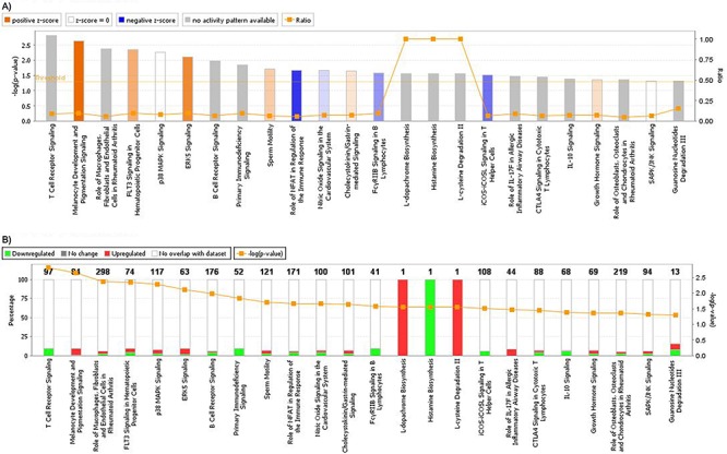
Figure 4. A. Graphic representation of canonical pathways according to OSCC differentially expressed genes.

In y axis, bars represent −log (p-value) (the larger the value, lesser is p-value). Bar colors represent z-score, where orange bars represent a significant increase in a given biological function; blue bars represent a significant decrease in biological function and grey bars show no significant increase or decrease. Orange lines and right y axis represent ratio, that is the ratio between the number of genes of your dataset relative to the total number of genes in a given pathway. B. Graphic representation of genes included in each pathway. Green shows downregulated genes, while red represents upregulated genes, and y axis shows the percentage of down regulated and unregulated genes, compared to the total number of genes in a given pathway. Right y axis and orange line shows −log (p-value).
