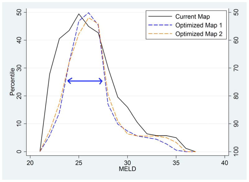
Figure 2. Distribution of median MELD at transplant across DSAs; by allocation scenario.
This mountain plot shows the cumulative distribution of median MELD at transplant across DSAs, folded at the median (i.e. the ascending part of the “mountain” indicates 0–50th percentile, and the descending part of the “mountain” indicates 50–100th percentile) to illustrate the dispersion of the distribution. The three lines show fully regional sharing over the current map (solid black line), Optimized Map 1 as in Figure 1a (dashed blue line), and Optimized Map 2 as in Figure 1b (dashed orange line). Note that Optimized Maps 1 and 2 significantly reduce geographic disparities as shown by the narrower interquartile range (indicated as a double-headed arrow on the figure).

