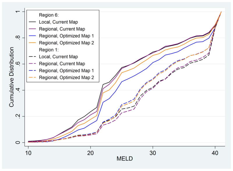
Figure 3. MELDs at transplant comparing Region 1 DSAs with Region 6 DSAs; by allocation scenario.
Cumulative distribution of MELDs at transplant, for DSAs in Region 1 (CTOP and MAOB, dashed lines) and in Region 6 (HIOP, ORUO, and WALC, solid lines) (i.e. Regions 1 and 6 as defined by the current map). Four allocation scenarios are shown for each: the current allocation system, black lines; fully regional sharing over current regions, purple lines; fully regional sharing over Optimized Map 1 as in Figure 1a, blue lines; and fully regional sharing over Optimized Map 2 as in Figure 1b, orange lines.

