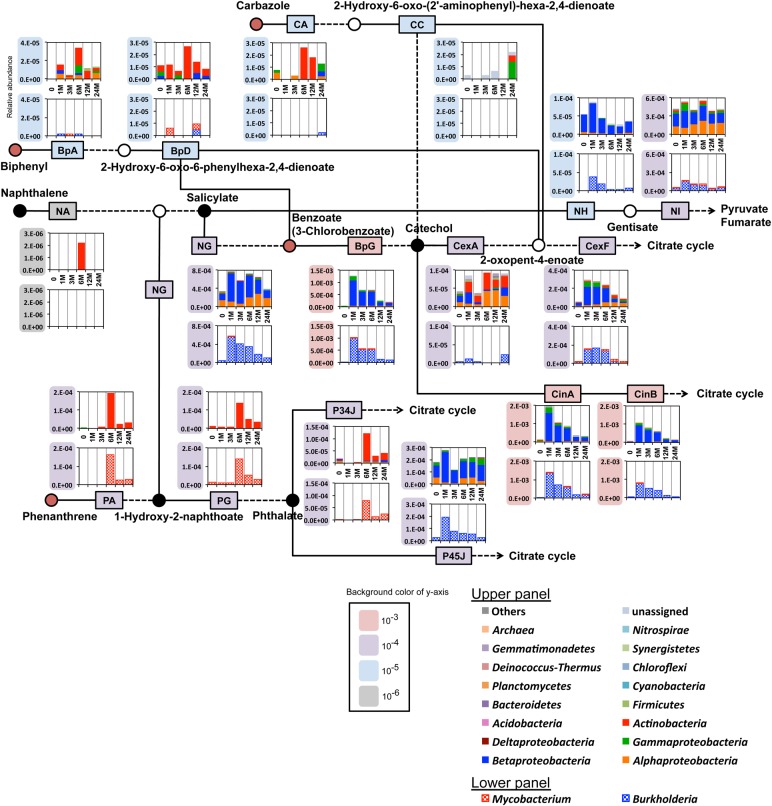
Figure 4.
Time-course changes in abundances of genes for aerobic degradation of aromatic compounds in polluted soil. A simplified pathway map for well-known aerobic degradation routes of the four polluted compounds. Boxes located in each route indicate representative reaction steps, and several steps (dashed lines) are omitted for simplicity. Abbreviations of enzymes are shown in Supplementary Table S5. The two graphs indicate the taxonomic compositions and the abundance of the genes in each reaction step. The upper graph shows the abundances at the phylum level (with the exception that the domain and class levels are shown for Archaea and Proteobacteria, respectively), and the lower graph the abundances at the level limited to the genera of Mycobacterium and Burkholderia. See Section 2 for the details to calculate gene abundances. Depending on the abundances, the scales of Y-axes of graphs are conventionally categorized into four groups with the following colours: grey, 10−6; blue, 10−5; purple, 10−4; and red, 10−3. More detailed results at the overall pathway map level by using the metagenomic samples from the control and polluted soils are depicted in Supplementary Figs S8 and S9.

