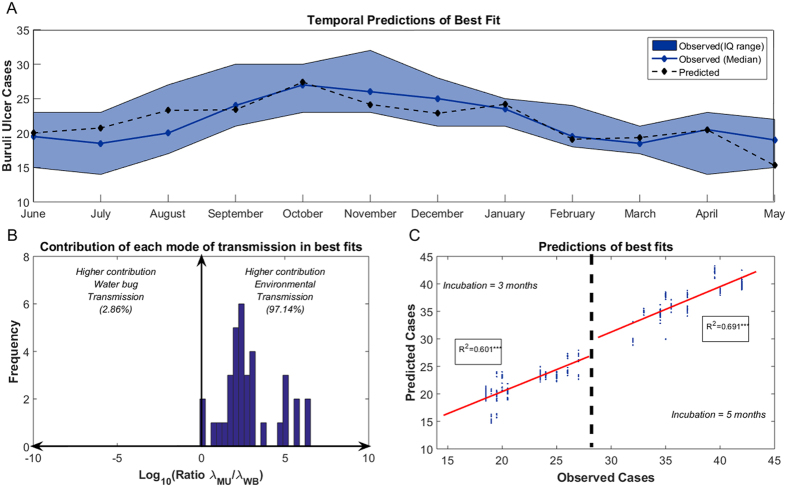
Figure 2. Predictions from the best fits in the mathematical (temporal) model.
(A) Fitting from the best fit (AIC = 57.49). The solid blue line and blue patch represent the median value and the interquantile range for the number of Buruli ulcer cases per month estimated for model fitting. Dashed black lines represent the model predictions for each month. In this fit ε = 1/3, δ = 1/3, λMU = 1.26E-4, λWB = 1.12E-7. (B) Ratio of the mean force of infection from the environmental transmission over that from the water bug transmission in the set of best fits. The ratio is in logarithmic scale (i.e. a ratio of 2 means that the environmental transmission was 100 times higher than the water bug transmission). The vertical blue bars represent the number of fits with a certain ratio λMU/λWB. (C) Predictions from the set of best fits (AIC = [57.49–59.49], n = 35) against the observed number of cases for an incubation period of 3 months (left) and 5 months (right). The solid red lines represent the linear regression line for each incubation period and the R-square of each regression is given in the inlet boxes (***p < 0.001).

