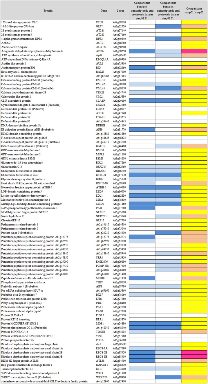
Figure 3.
Visualization as “heat map” of the comparison between transcriptomic data and proteomic data. In column 4 and 5, white rectangles indicate concurrency between transcript level and protein abundance, light blue indicates that high level of transcript has a low protein abundance, blue indicates that low level of transcript has high protein abundance. In the last column, yellow rectangles are for consistent behavior between the two mutants in the transcriptomic-proteomic cascade, orange is for contrasting behavior, specifically, pink is for a markedly opposite trend.

