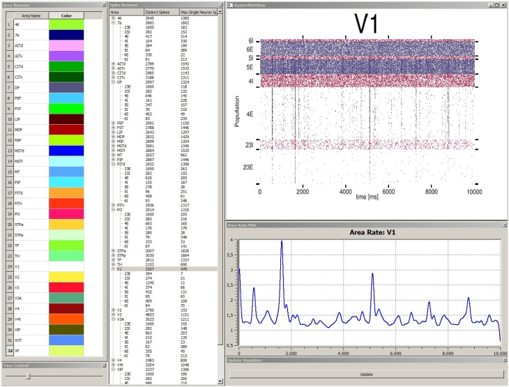
Figure 5.
Depiction of the data explorer view. This view provides several windows the user can interact with. The area browser (top left) lists all brain areas from the simulation model. A color can be assigned, which is later on used by the control view for area depictions. When the user double-clicks on an area name, the corresponding mean firing rate of this area is displayed as a function plot over time (see area rate plot window) which depicts the difference of spikes per time. The time control window (bottom left) provides a slider to navigate in time, which is also synced with the control view, to allow for convenient navigation in time of the simulation run. The spike browser window lists areas and the name of populations (inhibitory populations are marked in text labels as “I,” excitatory ones “E” respectively) neuron firing statistics. When the user clicks on an area, the raster plot for this area is shown (top right) where red depicts inhibitory populations and blue excitatory ones. The update window (bottom right) allows to manually emit notifications for views to sync data. Data depicted originates from Schmidt et al. (2014).

