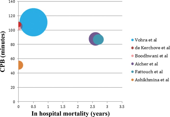
Figure 3.
Bubble chart displaying the average cardiopulmonary bypass (CPB) time (where available) per study and in hospital mortality. (Size of bubble is weighted with patient follow up years for each study. Studies from the same center that may represent similar or overlapping patients are removed to avoid duplication.)

