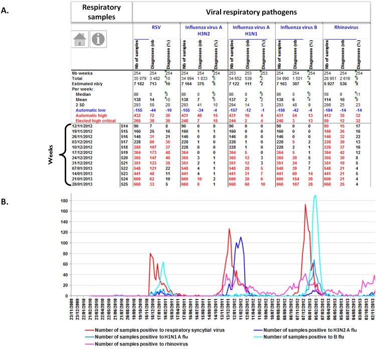
Fig 2. Examples of EPIMIC respiratory infection surveillance tables and plots.
Table (top; A) shows counts of respiratory samples and viral diagnoses entered each week in an EPIMIC Microsoft Excel file; numbers in red font are those above the alert threshold corresponding to the mean plus 2 standard deviations calculated for historical data and shown in the top rows of the table (the critical threshold was adjusted here by discarding from historical data those corresponding to epidemic periods). Plot (bottom; B) shows trends of weekly numbers of samples positive for respiratory viruses. Nb, number; RSV, respiratory syncytial virus.

