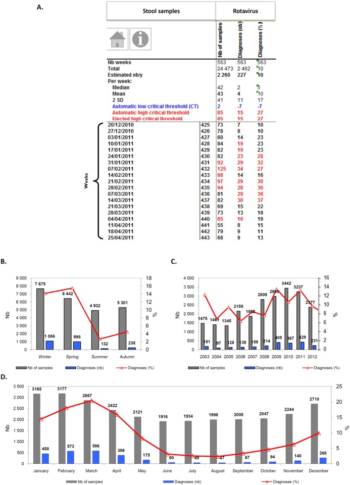
Fig 3. Examples of EPIMIC stool samples and rotavirus diagnoses surveillance tables and plots.
Table (A) shows counts of stool samples and positive diagnoses of rotavirus entered each week into an EPIMIC Microsoft Excel file; numbers in red font are those above the alert threshold corresponding to the mean plus 2 standard deviations calculated for historical data and shown in the top rows of the table. Plots B, C and D show cumulated weekly numbers of stool samples received at our laboratory, of positive rotavirus diagnosis, along with the proportions of positive samples per season (B), year (C) and month (D). Nb, number.

