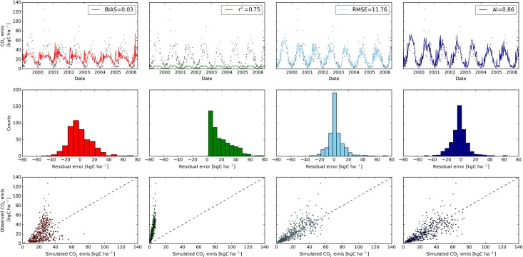
Fig 10. Comparison of measured and observed CO2 emission simulated with LDNDC (top panels).
Best model runs were derived with four different objective functions using a Latin Hypercube sampling approach (n = 50,000 model urns). The objective function BIAS is shown in red, r2 in green, RMSE in light blue and AI in dark blue. Observed values are shown as black dots. Middle panels depict classified residual error counts of simulated CO2 emissions for each model. The dashed black lines in the correlation plots of observed versus simulated CO2 emissions (bottom panels) show the theoretical optimal fit.

