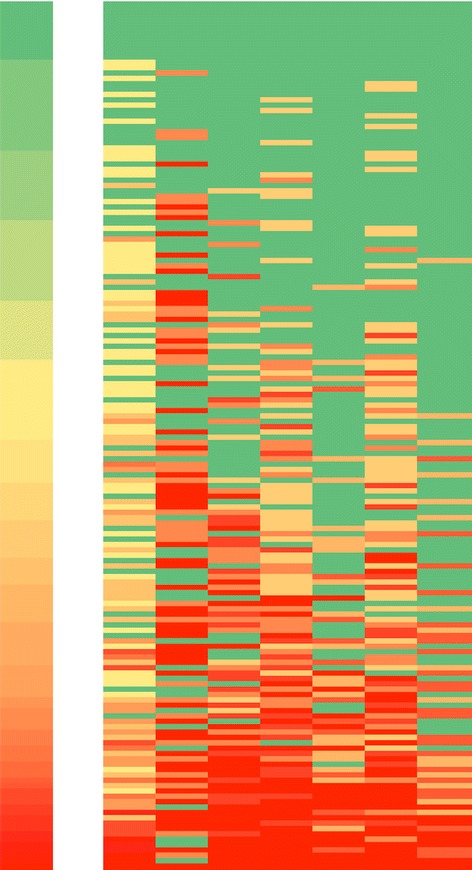
Fig 2.

Heat map of positive response rates. Heat map of domain-specific positive response rates (PRR) by hospital. Cell colors range on a scale from green (PRR = 100 %) to red (PRR = 0 %), where yellow represents the median. Each row represents 1 hospital. The left-most column represents the PRR of each hospital. Each of the following 7 columns represents an LOS-27 domain; from left to right: supportive learning environment, time for reflection, leadership that reinforces learning, experimentation, training, knowledge acquisition, and performance monitoring. Rows were sorted by overall PRR, with the hospital with the highest overall PRR displayed at the top and the hospital with the lowest overall PRR at the bottom
