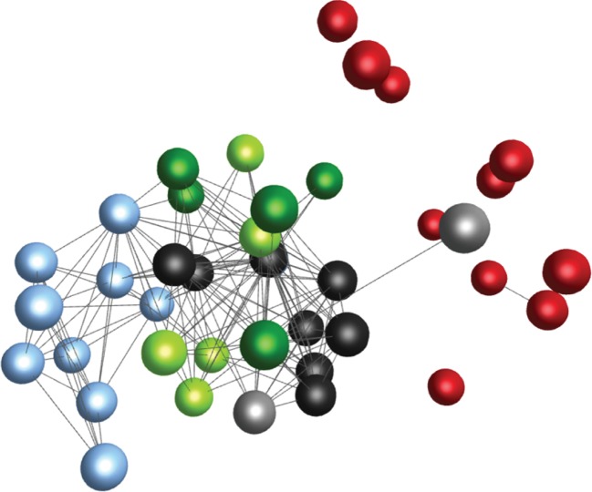
Figure 5.
Graphical representation of similarities between truncated trajectory sequences associated with different mouse inbred strains and survival groups within the mouse strains. Each node (ball) represents an individual mouse, and each edge (connecting line) represents the degree of similarity between trajectory sequences of two mice, represented by 1−H, where H is the pairwise Hamming distance. Only similarities 1−H > 0.8 are depicted in the graph. Colours represent different mouse strains and survival groups, respectively. The graph was produced with BioLayout Express 3D software [24], which spatially distributes the nodes according to the similarity measure 1−H, so that individuals with similar trajectory sequences (i.e. 1−H close to 1) are placed in close proximity to each other, whereas individuals with different trajectory sequences (i.e. 1−H close to 0) are placed far apart. The graph illustrates that differences between trajectory sequences were on average smallest within each mouse strain, and greatest between C3H mice (light blue; all succumbing to infection) and B6J mice (red; all surviving infection). Within the A/J (black) and BALB (green) mice, sequences associated with survivors and non-survivors survival (survivors: light; non-survivors: dark) did not fall into different visual clusters. The graphical results were confirmed by statistical cluster analysis (see text).

