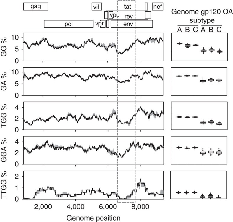
Figure 3. Mutation-prone A3 targets showing significant depletion in the gp120 OA domains.
A map of the HIV-1 genome is shown on top, with each reading frame shown at a different level. The skyline plots represent the percent abundance of each motif averaged over a 0.5 kb sliding window for 100 sequences of each subtype A, B and C. The grey shaded area around the black line represents the range of variation among subtypes. The dashed box shows the 1 kb region encoding the gp120 OA domains. Genome positions correspond to the HXB2 sequence. To the right of each skyline plot is shown a boxplot of the motif abundance in the gp120 OA domains versus the rest of the genome, based on the 100 individual values from each subtype. The lines in the box indicate the first, second (median) and third quartile. Whiskers above and below the box indicate percentiles 10 and 90, and outlying points are individually plotted.

