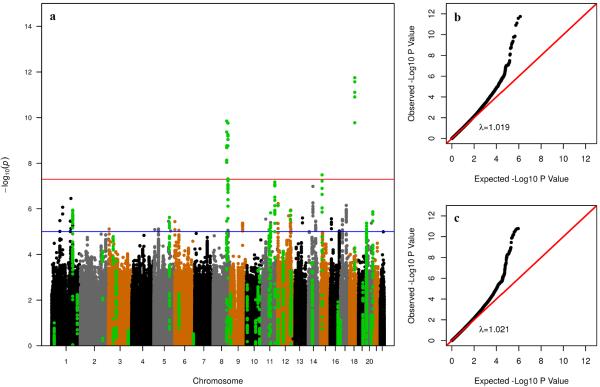
Figure 2. Association results.
(a) Manhattan plot of results in GECCO/CCFR. Controls with family history and/or polyps are excluded from the analysis. Each dot represents a SNP plotted on the x-axis relative to its position in the genome, whose level of significance is represented on the y-axis. Green dots represent SNPs in LD with SNPs identified in published GWAS for CRC. Replication in CORECT was attempted for SNPs with p<10−5 (blue horizontal line). The red horizontal line indicates p=5×10⁻⁸; (b) quantile-quantile plot of p-values in (a), on the negative log scale. λ is the inflation factor (the ratio of observed to expected median); (c) quantile-quantile plot of p-values when no controls are excluded from the analysis.

