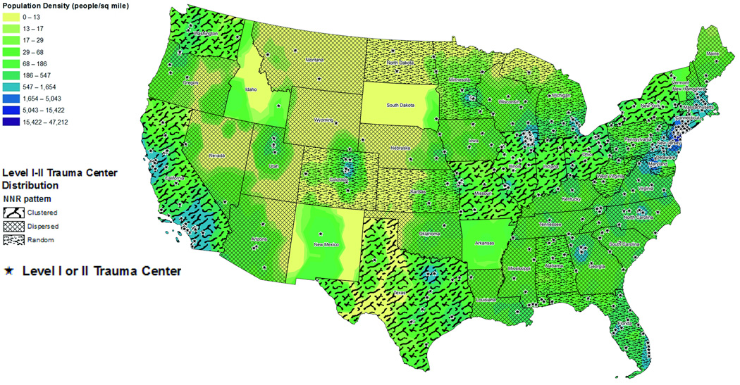
Figure 2.
Continuous population density across the United States using county population density. Population density is represented by color ramp, with higher values represented in blue and lower values represented in yellow. Trauma center geographic distribution based on significance of the NNR is represented by patterned overlay. Level I or II trauma center geographic locations are represented by black stars.

