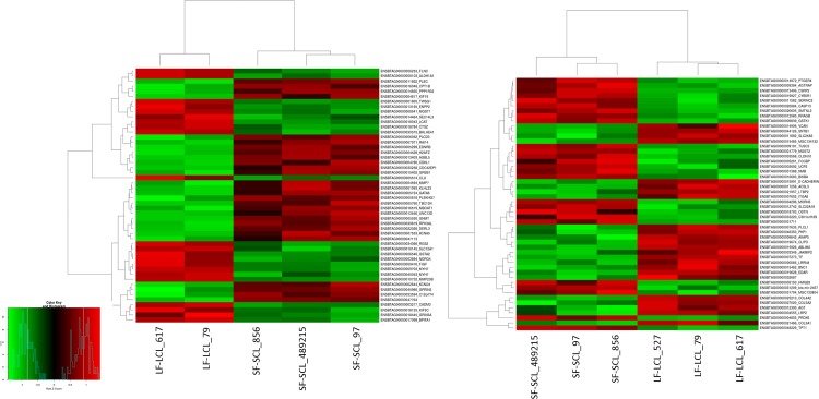
Fig 5. Heat map constructed by clustering of the 50 most differently expressed genes between LF/LCL and SF/SCL in the ampulla (n = 5) and the isthmus (n = 6).
The colors in the map display the relative standing of the reads count data; GREEN indicates a count value that is lower than the mean value of the row while red indicates higher than the mean. The shades of the color indicate distance from each data point to the mean value of the row. Columns represent individual samples of LF/LCL and SF/SCL.

