
Fig. 4.
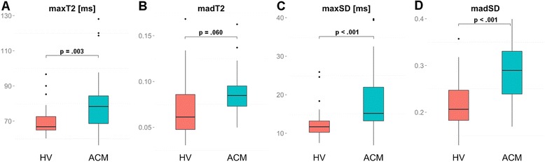
Box-Whisker plots representing the differences of maxT2 (a), madT2 (b), maxSD (c), and madSD (d) between HV and ACM patients. The centreline in each box represents the median, whereas the lower and upper limits of each box represent the 25th and 75th percentiles, respectively. Whiskers extend to the most extreme observations within 25th and 75th percentiles ± 1.5*IQR. Observations outside these whiskers are shown as dots. *** IQR - inter-quartile-range, ACM - acute myocarditis, HV - healthy volunteers