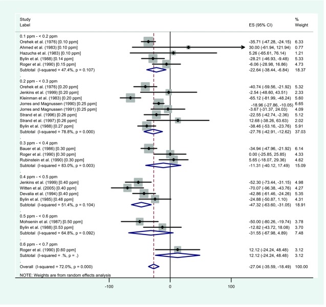
Figure 2.
Forest plot showing the difference in responses to airway challenge provocative doses following exposure of asthmatics to NO2 vs. air. This figure illustrates the types of meta-analysis findings that can be graphically illustrated in a forest plot, e.g., the average change per dose from each study (the central dots within the squares), the proportional weights used in each meta-analysis (the squares), and summary measures and confidence intervals for each dose level (horizontal lines) and the overall study (the center lines and lateral tips of the diamonds). The results from individual studies and study combinations can be compared with the vertical lines (with the solid line indicating no effect and the dotted line indicating the overall summary measure) to assess whether results are consistent across studies or whether a dose-response relationship appears to exist. Adapted from Goodman et al.19

