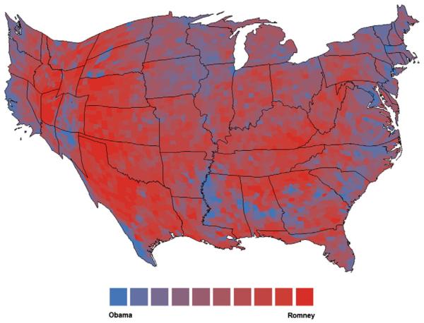
Fig. 1.
Cartogram of county-level age-adjusted adult obesity prevalence rates (%) and support for Mitt Romney in the 2012 U.S. presidential election. The size of each county is rescaled and redrawn according to its obesity prevalence rate. Counties are shaded according to levels of support for Mitt Romney (i.e., reds) or Barack Obama (i.e., blues).

