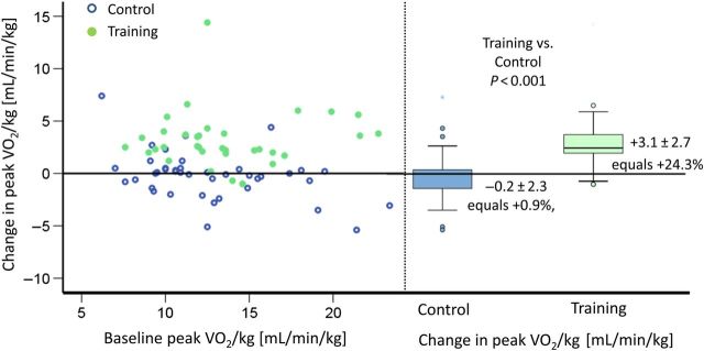
Figure 2.
Primary endpoint: change in peak oxygen uptake. Left graph: The abscissa shows peak VO2/kg at baseline, and the ordinate shows change of peak VO2/kg from baseline after 15 weeks for each patient. The solid points represent patients of the training group, and the circles represent patients of the control group. This graph shows equal distribution of baseline peak VO2 in both groups as well as changes after 15 weeks of exercise training. Change in peak VO2 did not correlate with baseline peak VO2. Right graph: the boxplots at the right side show median change of VO2 max in the control vs. training group after 15 weeks. A significant increase can be shown in the training group (P < 0.001), whereas the control group shows a small reduction in peak VO2 after 15 weeks. Multiple imputations showed the same P-value.

