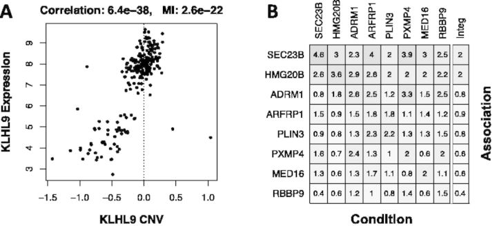
Fig. 1.
(A) Scatterplot for KLHL9 CNV vs. mRNA expression. Spearman correlation and MI p-values are indicated on top of the figure. (B) Heatmap showing the association (-log10(p)) between genes affected by genetic alterations (rows) and STAT3 inferred protein activity, while conditioning on each of the genetically altered genes (columns). The rightmost column indicates the weakest association for each gene

