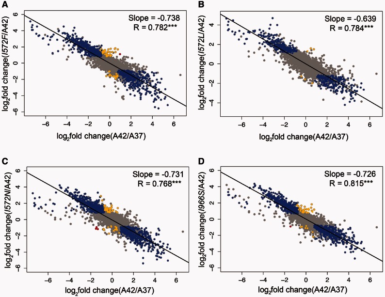
Fig. 4.
Global changes in GE during the acclimation and adaptive response. In all the graphs, the x-axis represents the acclimation changes (ancestor grown at 42 °C vs. ancestor grown at 37 °C). The y-axis represents the changes at different steps of the adaptive walk: First-step adaptive mutations (I572F, I572L, I572N) and a single mutant (I966S) vs. ancestor grown at 42 °C. Changes in expression were categorized and colored as follows: Restored (blue), reinforced (red), and novel (yellow). Both unrestored and uninformative genes are colored in grey. The black line represents the linear regression fitted to the dots in each graph.

