
Figure 5. Kaplan-Meier survival analysis by X-tile plots cut-off point.
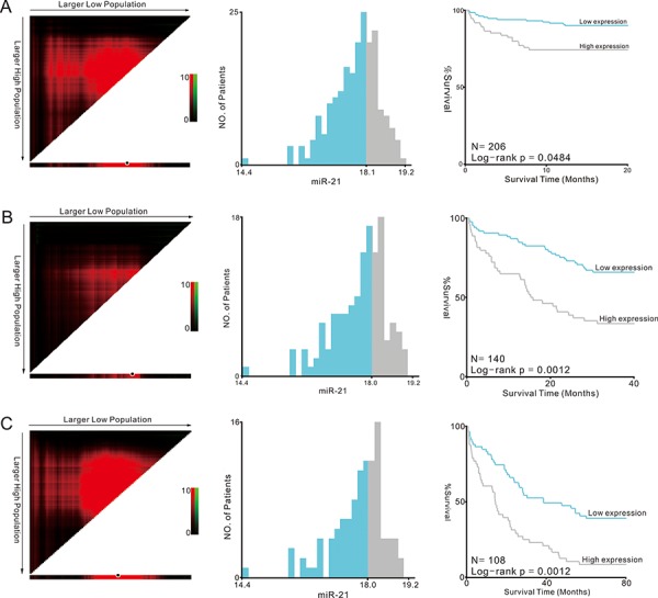
A. 1-year survival analysis; B. 3-year survival analysis; C. 5-year survival analysis X-tile plots are shown in the left panels. The plot showed the chi-squared log-rank values created when the cohort was divided into two groups. The optimal cut-point highlighted by the black circle in the left panels is shown on a histogram of the entire cohort (middle panels) and a Kaplan-Meier plot (right panels).