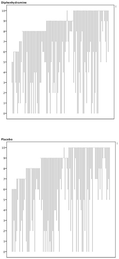
Appendix Figure.
Line graph representing each participant’s experience at baseline and one hour later. The origin of the line depicts the 0 to 10 pain score at baseline. The terminus of the line depicts the 0 to 10 pain score at one hour. The graphs are sorted by baseline pain score. Thus, lines that rise unexpectedly depict participants whose pain worsened during the study period.

