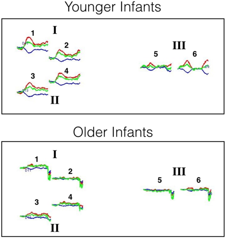
Figure 5.
Hemodynamic response curves for the younger and older infants of Experiment 2. The number above each plot refers to the channel number and the Roman numerals refer to areas of interest. All regions are thought to lie within the posterior temporal cortex. The plot shows the mean HbO (red lines), HbR (blue lines), and HbT (green lines) curves in μM cm. Time is on the x-axis: the first black line on each plot denotes the onset of the 20 s test trial and the second black line denotes the onset of the 10 s baseline interval.

