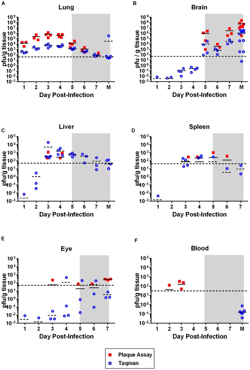
FIGURE 2.

Virus dissemination over time. Virus was measured in the indicated tissue by plaque assay (solid squares; pfu/g tissue) or taqman RT-PCR (open circles; pfu equivalents/g tissue). Horizontal line on each graph represents the limit of detection of the plaque assay (50 pfu). The gray shaded box on all graphs represents the window of clinical disease (5–7 dpi). For (A–C,F), the M on the x-axis stands for ‘moribund’ and represents historical samples from previous Lewis rat experiments (correspond to 7–8 dpi). Tissue samples were taken at the time the rat was moribund and are included here for comparison purposes. These samples are not available for (D) and (E).
