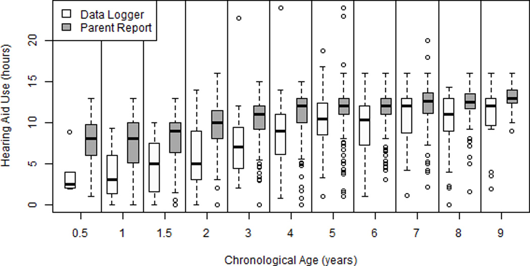
Figure 1.

Box plot of amount of HA use based on data logging and parent report over time. The central lines represent the median values and the box limits are the 25th and 75th percentiles. The lower fence is from the 10 to 25th percentile and the upper fence is from the 75 to 90th percentile. The circles represent outliers at the upper and lower 10th percentiles.
