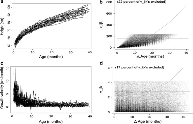
Fig. 1.

Panels a, c shows a spaghetti plot of the height and height velocity raw data from 50 participants respectively. Panels b, d show the variograms corresponding with each data set, where values in the x-axis represent the distance in time between two measurements and values in the y-axis (vijk) represent the square distance between those two observations [29]
