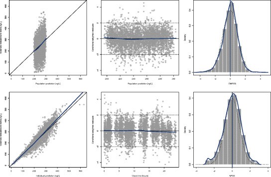
Fig. 3.

Diagnostic plots of the model developed to characterize testosterone kinetics in hypogonadal men. Left panels represent the scatterplots of observations and population predictions (upper panel, a) and the observations and individual predictions (lower panel, b). Middle panels show scatterplots of conditional weighted residuals and population predictions (upper panel, c) and time (lower panel, d). Right panels represent the density plots of conditional weighted residuals (upper panel, e) and normalized prediction distribution errors (lower panel, f). Blue lines represent the smooth regression line in scatterplots and the density line in density plots. Dotted black lines represent the theoretical density line
