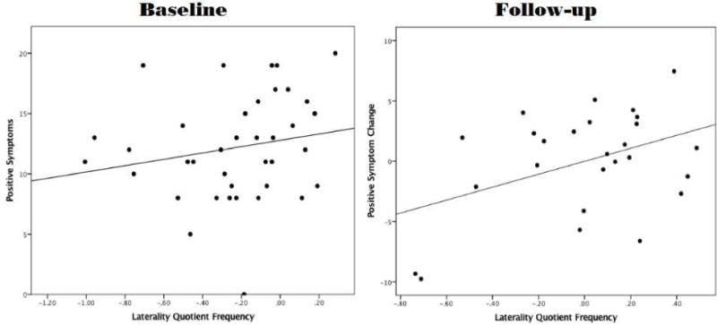
Figure 2.

The figure shows two scatter plots: the first plot shows the relationship of LQFREQ to positive symptoms at baseline. The second plot shows the relationship between LQFREQ and positive symptom change over the 12-month follow-up period. More positive numbers on LQFREQ indicate decreased dextrality. More positive numbers on the Y-axis indicate that the total SIPS positive symptom score was higher at follow-up than at baseline.
