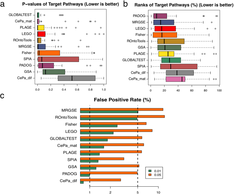
Figure 5. Comparison of the performance of different methods using a benchmark of 34 disease gene expression datasets.
The p-values (a) and the ranks (%) (b) of the target pathways produced by different method are shown in boxplots. (c) The false positive rate of different methods is shown as the percentage of all pathways found significant at different significant level (0.01 and 0.05) from 50 sample permutation results. The vertical lines indicate the expected level of false positive rate at a given significance level.

