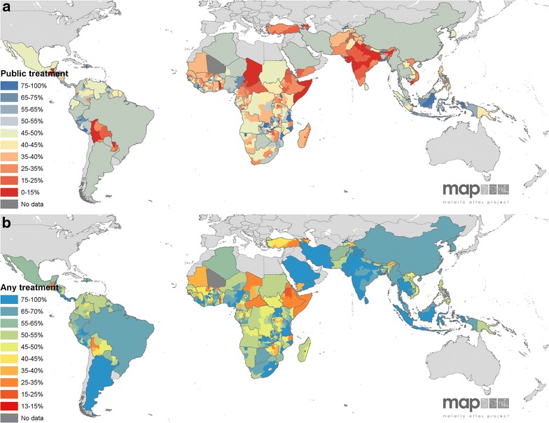
Fig. 3.

Observed and predicted treatment-seeking proportions. The observed treatment-seeking values in the regions shown in Fig. 1 are mapped along with the national-level predicted values for the proportions seeking a government/public treatment and b any treatment. Treatment-seeking rates are shown from red (low access) to blue (high). Dark grey areas are those with no data and light grey regions are at no malaria risk
