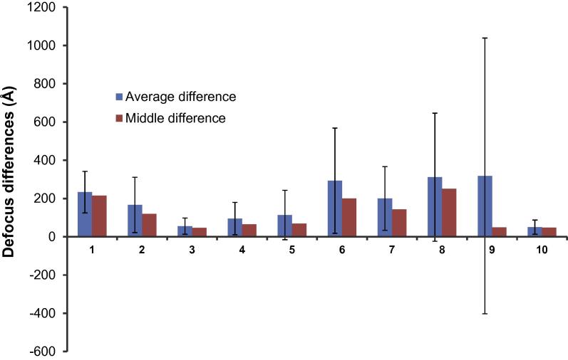
Fig. 6.
Statistics of the defocus differences between Gctf and CTFFIND3 for the nine benchmark datasets. Number 10 is a dynactin dataset used in Fig. 5 of (Zhang, 2015). Blue columns represent the averaged differences; red columns represent the middle differences, meaning 50% micrographs have the differences lower or higher than this value in each dataset.

