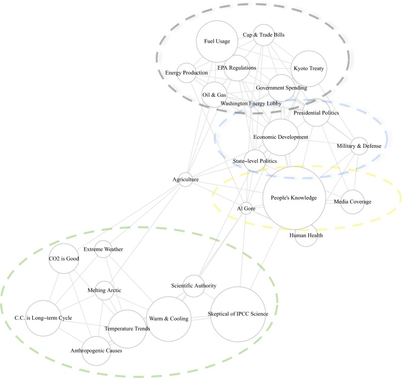
Fig. 3.
Graphing positive correlations between topics from Fig. 2. Topics near each other, and with a tie, indicate that they are more likely to be discussed within a document. Node sizes correspond to the topic proportions from Fig. 2 and are graphed using the Fruchterman–Reingold algorithm. Colored ellipses were added after graphing to point the reader toward the emergence of four distinct clusters.

