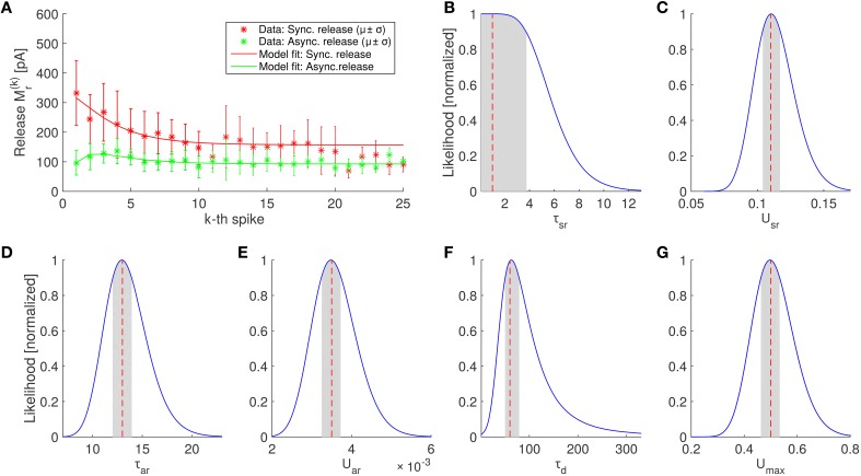
Figure 4.
Parameter estimation of the SAR model and comparison of the best fitting SAR model with experimental data. (A) Average amount of neurotransmitter release in the periods after the kth spike in experiments (asterisks) for synchronous and asynchronous release periods (red and green colors, respectively) and prediction of the SAR model (solid lines). The model captures the experimental observation very well (log likelihood value –52.8259, see Equation 19), although the fit was only constraint by the first 10 spikes (see Section 4). Error bars indicate standard deviations. Note that the number of trails for each spike is different. In particular, for spikes 21–25 only 3 trials were available (see Section 4). (B–G) Scaled likelihood along each dimension around the optimal parameter set for the 6 fitted parameters of the SAR model. Shaded areas indicate the region where the likelihood is above 90% of the maximal value, when the single parameter is varied while all other remain fixed.

