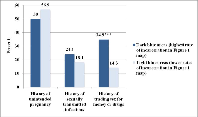
Figure 2. Frequency of Women's Sexual Health Outcomes by Neighborhood Incarceration Density, N=290.
We split the sample according to the Figure 1 map: those women in the highest incarceration areas represented by the darkest blue were in one group (N=135, 48.2%), and those in all other areas were assigned to the other group (N=145, 51.8%) for comparison.
*p≤0.05, **p≤0.01, ***p≤0.001

