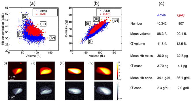
Figure 4.
Comparison between the QAC and the clinical hematology analyzer. (a, b) Show scatter plots measured by both systems of the volume vs. hemoglobin concentration and volume vs. hemoglobin mass of the same sample. Below the scatter plot are displayed mass and height maps of four cells occurring at the edges of the distribution. (c) Shows a chart that compares the mean and standard deviation of volume, mass and concentration for the two measurement systems. [Color figure can be viewed in the online issue, which is available at wileyonlinelibrary.com]

