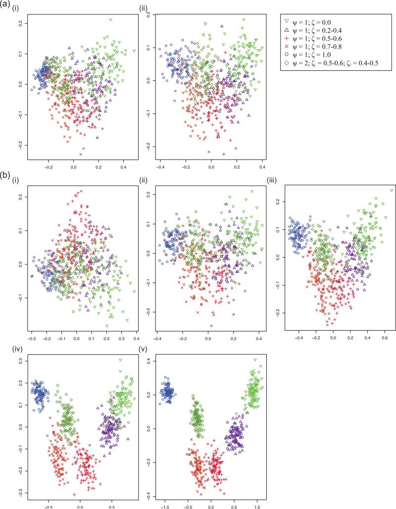
Figure 4. PCA graphs for simulated aSFSs.
Each PCA graph was derived from 600 simulated aSFSs corresponding to six different synchronous expansion scenarios (100 replicates each); the scenario that each point corresponds is referenced in the legend. PC1 is plotted on the x-axis and PC2 is plotted on the y-axis. See Tables 1 – 3 for more information on the specifics of the synchronous expansion scenarios pertaining to each sampling configuration and simulation parameterization settings. (a) Comparing differences between individuals/taxon sampling levels at 10 taxa. Note that there was hardly any change (and perhaps even increased dispersion) as the number of haploid samples increased. i) 10 haploids/taxon (sampling configuration 4). ii) 50 haploids/taxon (sampling configuration 6). (b) Comparing differences between taxa amount at 20 haploids/taxon. Note that the clustering for synchronous expansion scenarios tightened and became more distinct as number of taxa increased. i) 5 taxa (sampling configuration 2). ii) 10 taxa (sampling configuration 5). iii) 20 taxa (sampling configuration 8). iv) 50 taxa (sampling configuration 11). v) 100 taxa (sampling configuration 14).

