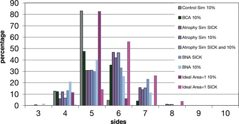
Figure EV4. Polygon distribution of different subset of cells from muscle samples and simulations.

Comparison of the polygon distribution of different subsets of cells: the atrophic cells of the BNA images (see Materials and Methods), the 10% of the smallest cells from BCA and the three simulations, and the selected “sick” cells with different parameter values from the atrophy simulation and ideal area = 1 simulation (see Materials and Methods). “control simulation 10%”, “ideal area = 1 simulation 10%”, “BCA 10%”, “BNA 10%” and “atrophy simulation 10%” presented a higher percentage of pentagons than hexagons. On the other hand, when analysing the “atrophic cells” from “BNA sick” and “atrophy simulation sick,” an increase of hexagons and heptagons was observed. “Atrophy simulation sick”, “atrophy simulation 10%” and “atrophy simulation sick and 10%” presented a similar polygon distribution since in this simulation most of the sick cells are included in the 10% smaller cells (Table EV2). The small difference between “BNA 10%” and “BNA sick” reflected the presence of small rounded cells inside the smaller 10% of BNA cells. The polygon distribution of the “ideal area = 1 sick” cells was due to the higher area presented by this subset of cells that gives them higher number of neighbours (Fig 6C and Table EV2).
