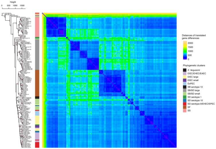
FIGURE 3.
Hierarchical clustering and heat map illustrating the differences in predicted protein homologs between genomes. Manhattan distances were calculated from a pairwise abundance matrix of 3,777 predicted protein homologs that were identified using the default BLASTP bidirectional best hit approach (75% amino acid sequence coverage, 1e-05 E-value and 60% sequence identity) within the program GET_HOMOLOGUES (Contreras-Moreira and Vinuesa, 2013). Only genes shared by at least two samples were included. Blue cells on the heat map indicate that genomes share more similar genes. The dendrogram on y-axis indicates hierarchical clustering of the abundance matrix using the average linkage method and Manhattan distances with bootstrap probabilities (BP, only values of ≥80 shown in black) and approximately unbiased p-values (AU, only values of ≥95 shown in red) from 10,000 replicates. The phylogenetic group of each genome from Figure 1 is represented as a colored bar in between the dendrogram and the heat map.

