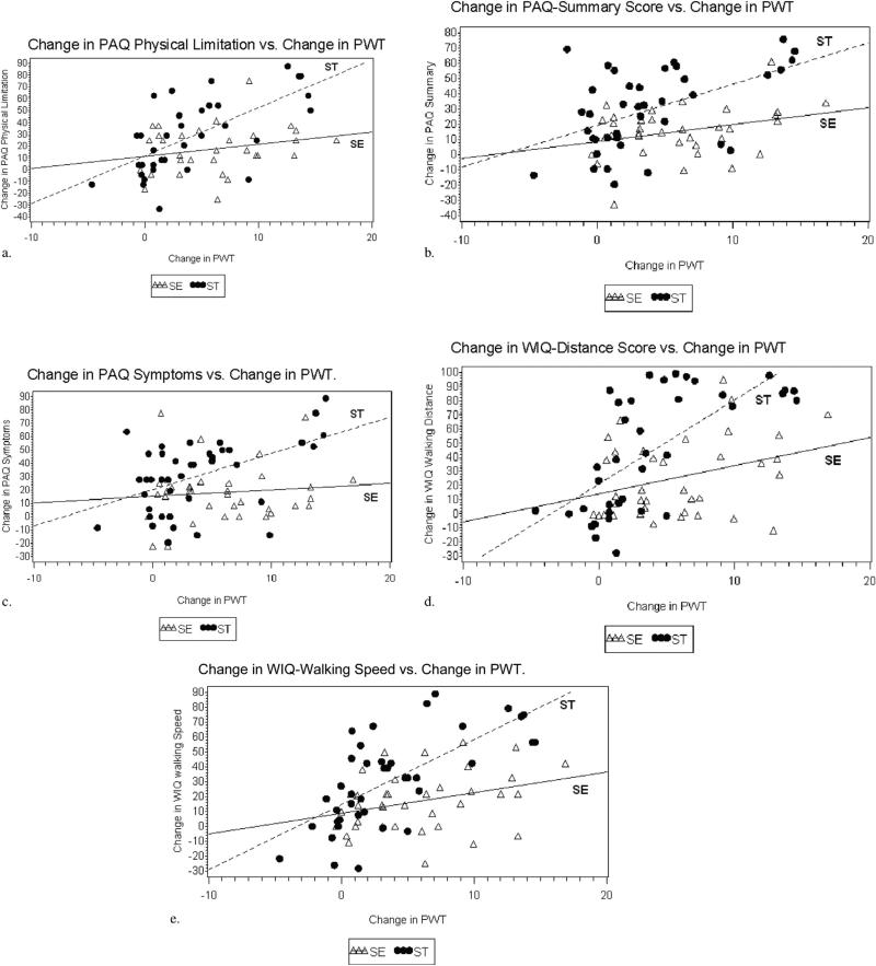
Figure 1.
(a–e) Scatterplots of the change in disease-specific QOL versus change in PWT. The change in PWT at 6 months compared with baseline is on the x-axis, and the change in the patient-reported symptom outcome scale at 6 months compared with baseline on the y-axis. These plots show considerable scatter of SE data points with no statistically significant correlation and little if any slope in the plotted line. Conversely, an increase in PWT in ST participants at 6 months correlated strongly with improved symptom scores.

