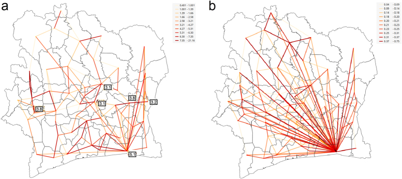
Figure 4. Strong mobility ties discovered through summarizing (a) all mobilities (b) mobilities with 3 days or longer stay at the destination.
The hubs are labeled with the corresponding HIV prevalence rates shown in Fig. 1(b). The link thickness and color, ranging from yellow to red, are proportional to the strength of mobility flow. (We used open source QGIS software59 to create maps).

