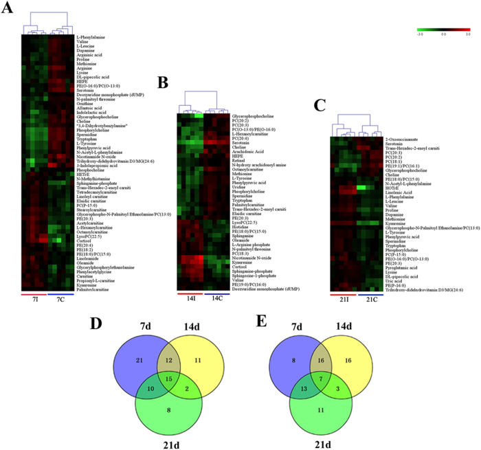
Figure 4. Comparison of the mice serum metabolomes during the course of infection.
Heat maps representing the significantly changed metabolites between infected groups and the corresponding control groups in ESI+ mode (A–C). Individual samples are separated using hierarchical clustering, with the dendrogram scaled to represent the distance between each branch. Heat maps show a clear separation of metabolomic profile between different groups. Normalized signal intensities (log2 transformed and row adjustment) are visualized as a color spectrum and the scale from least abundant to highest ranges is from −3.0 to 3.0. Green indicates low expression, whereas red indicates high expression of the detected metabolites. (A) 7D infected group vs 7D control; (B) 14D infected group vs 14D control; (C) 21D infected group vs 21D control; (D) Venn diagram shows a clear separation among sample groups at the three indicated infection time points in the ESI + mode; (E) Venn diagram shows a clear separation among sample groups at three indicated infection time points in the ESI- mode.

