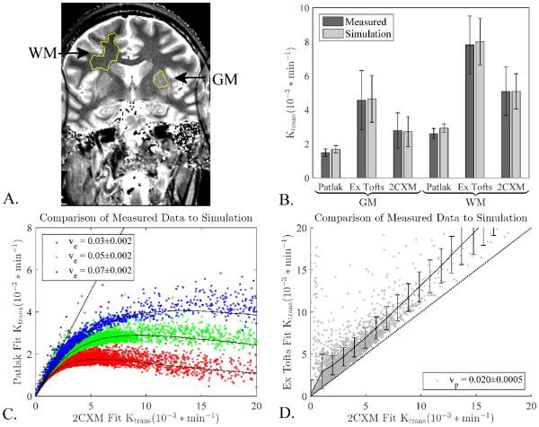
Figure 1.
Simulation results compared to collected data in healthy controls. A) Typical ROIs for a single subject. B) Mean values and standard deviations of measured Ktrans values from GM and WM regions defined in the subjects correspond well to simulated results. Simulated curves were generated and all three models were fit to the simulated data to ensure that the population AIF and generating procedures would give values and noise characteristics similar to the measured data. The similar results for each model show that the simulated curves are representative of the real data. C) Each dot represents a voxel from a healthy control and the black lines are simulation results using the central ve value measured from the clinical data, error bars on simulation results excluded for clarity. D) Same as C, but comparing extended Tofts to 2XCM and using the central vp value measured from the clinical data. Error bars are the standard deviation. The measured voxels follow the simulation results extremely well showing the simulations captures the different behavior of each model. Dotted line indicates slope of unity, i.e. where Patlak or extended Tofts fit is identical to 2CXM fit.

