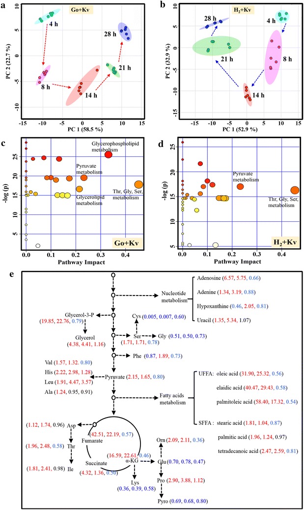
Fig. 3.

Metabolomic analysis on the relationship optimization of G. oxydans–K. vulgare consortium. a PCA score plot of time-series metabolomics data of Go + Kv; b PCA score plot of time-series metabolomics data of H2 + Kv; c Pathway enrichment analysis of consortium Go + Kv, circles represent all the matched pathways according to KEGG. The color and size of each circle is based on P values (y-axis) and pathway impact values (x-axis), respectively. The darker the circle color, the more significant and coordinated changes of metabolites in the matched metabolic pathway. The bigger the circle size, the higher the centrality of its involved metabolites. d Pathway enrichment analysis of consortium H2 + Kv; e Fold changes of metabolites in central carbon metabolism and related metabolism. The numbers in the bracket from left to right indicated the fold changes of metabolite abundance in consortium Go + Kv relative to Go, in H2 + Kv relative to H2, and in H2 + Kv relative to Go + Kv, respectively. Red numbers indicate the increased levels, and blue numbers indicate the decreased levels
